The Brothers Cup is an alternative funk rock band based in Ludwigshafen, Germany. Im proud to be the guitarist and singer of this three man combo. After a few years of playing together on and off, we’ve had some productive times and played a few small gigs in 2018 and 2019. We started writing our own material around the summer of 2019 and eventually decided to record some of our work. The idea of recording an album was born. In order to share our project with friends, family and anyone else interested, I hacked together a little one-pager for this project.
Introducing the official The Brothers Cup website - stop by and have a look…and listen to our latest tracks!
The site is not optimized in terms of lazy-loading images or anything of the sort. There simply was not enough time on my hands to invest into this project. But fear not - there are some cool tricks to get by for now.
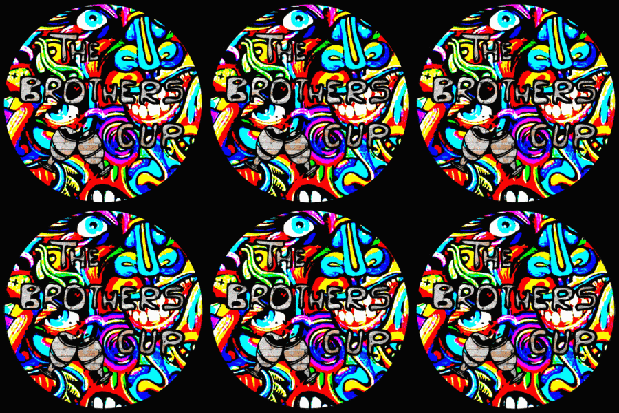
Instead of optimizing the site by adding features such as lazy-loading images, I created a little loading animation to pass time. I think this adds a unique little touch and is a nice build-up when entering the site. There is even a small swirling loader icon for the page, based on our bandlogo.

You can create these kinds of effects with fancy image processing software. Or you can use this awesome tool over at photomosh.com, which is exactly what I did. Throw an image at this tool and play around with a broad pallette of effects until you’ve got something you like.
To make things look smooth, a fade in animation will do the trick. Now all we need to do is add a few lines of javascript to display this image in the foreground with a black background covering the entire viewport, until the content of the page has finished loading. Followed up by a fadeout and fadein of the completely rendered page, this is good enough.
In order to spice up the design of the otherwise simple page, let’s quickly head back to photomosh.com and throw in a more subtle effect for the main logo image at the top of the website. The static page was looking just a tiny bit too sterile for our taste. A subtle melting animation gave this logo a little more of a “psychedelic 60’s” vibe.

This site is really a quick-and-dirty solution to provide the means of sharing our music with anyone interested. It’s not perfect, and if I had more time on my hands currently, I would tackle some of the inherent issues, such as cleaning up the CSS, improving the performance of the site and of course adding SSL encryption. Apart from that, what’s important for now: it does its job.
I hope you enjoyed this project, keep on rocking and thanks for stopping by!